Travel assistant powered by AI
Yond
Yond is a smart travel app that helps users discover inspiration, collect ideas, and effortlessly turn them into bookable trips. Think of it as a mix of Pinterest for travel inspiration and a travel assistant powered by AI.
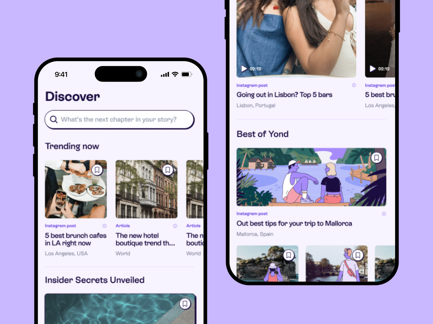
My role
Product Design (UX & UI) · User Research & Testing · Information Architecture · Design System & Components Library · Collaboration with Founders & Developers
The project
I joined Yond early on as the sole product designer, working directly with the founders and developers. At that time, the product existed only as a simple MVP without a clear design direction. My mission was to reimagine the experience, redesign the app (V2), and establish a strong design system to support rapid growth.
Challenges
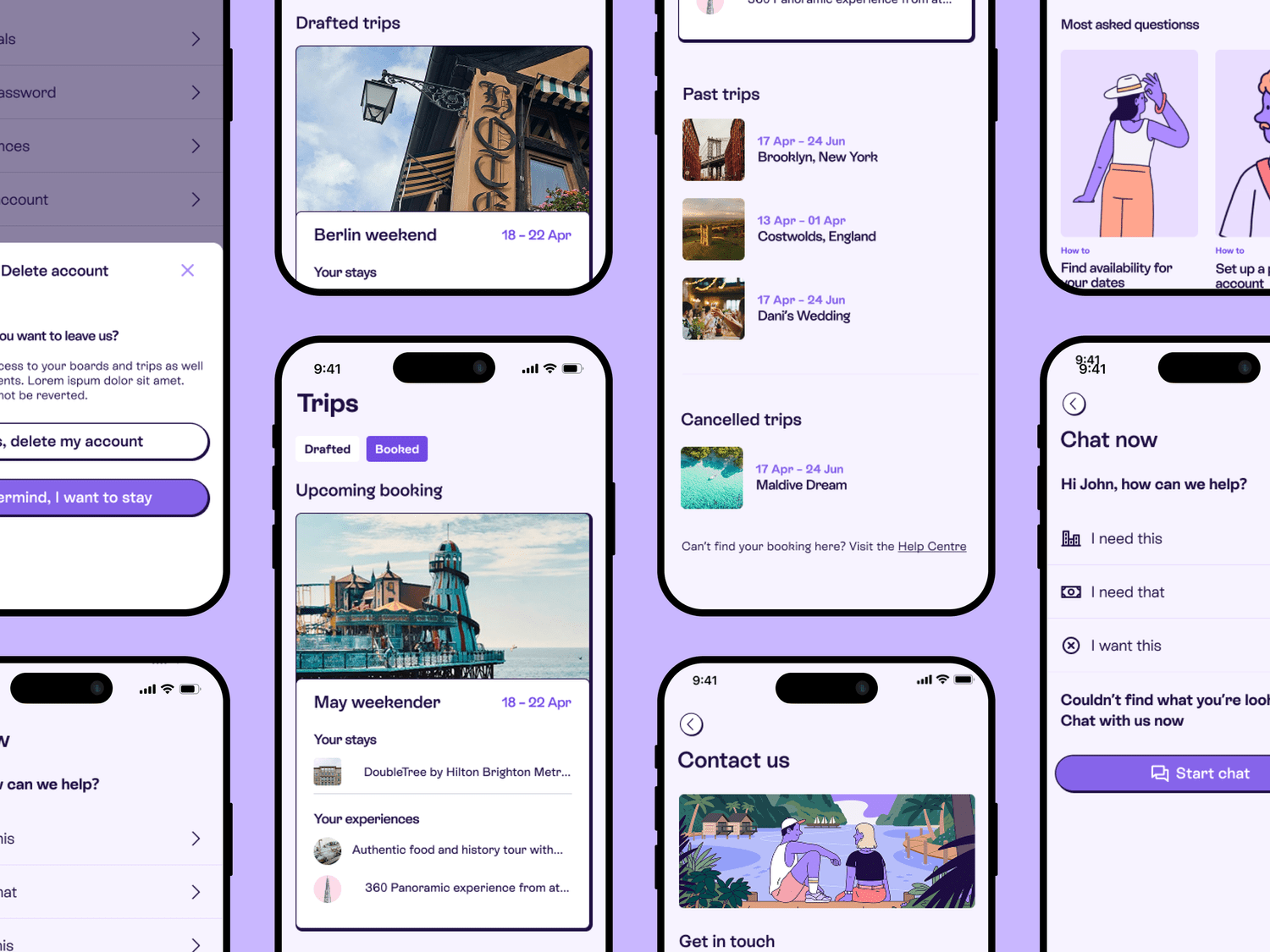
The MVP lacked a coherent user journey and had fragmented flows. There was no consistent design system, making development and iteration slow. Users struggled with the value proposition: collecting inspiration was fun, but how it translated into actual trip booking wasn’t clear. The app needed to balance inspiration browsing (Pinterest-like) with practical planning (trip building and booking).
Reviewing the information architecture
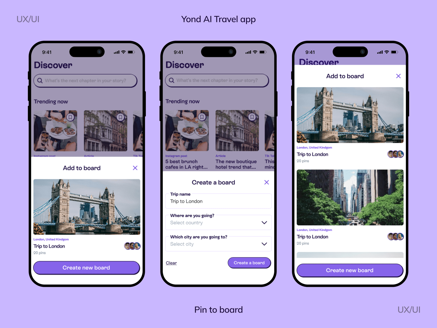
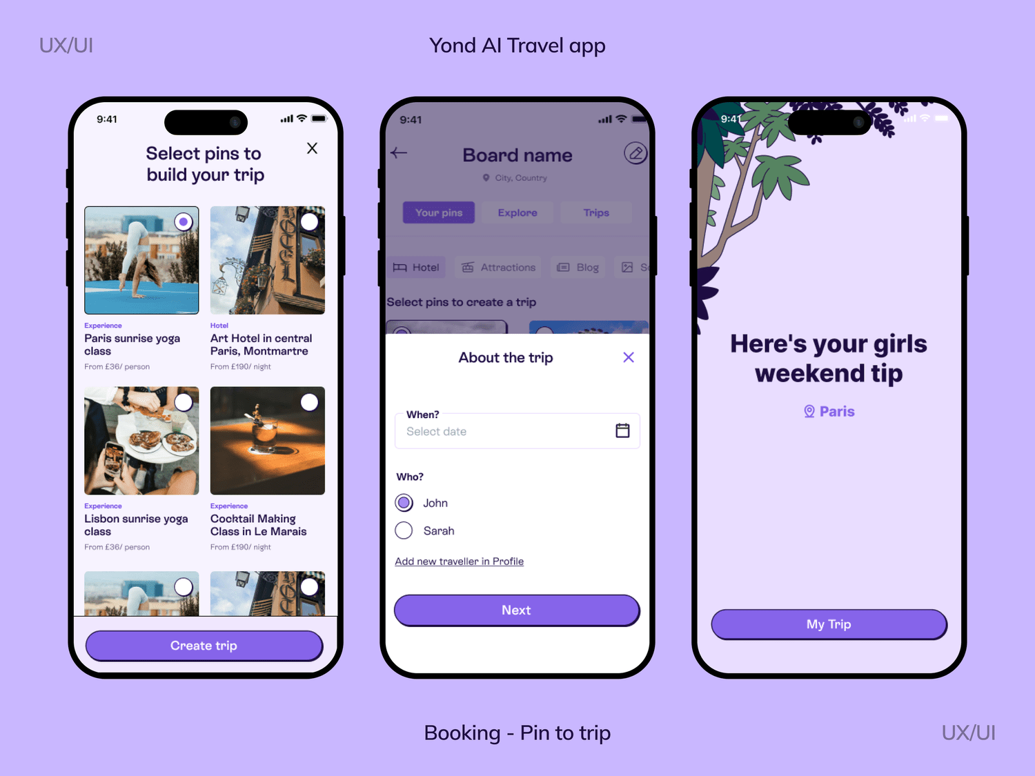
I started by mapping the existing product flows and identifying pain points in the user journey: Users could browse content but had difficulty saving and organising it. The step from “inspiration board” → “bookable trip” was confusing. Navigation felt scattered, with unclear entry points for trip creation. I redesigned the architecture with a clear funnel: Discover → Save (Pin) → Organise (Board) → Generate Trip → Book.
Designing core user flows
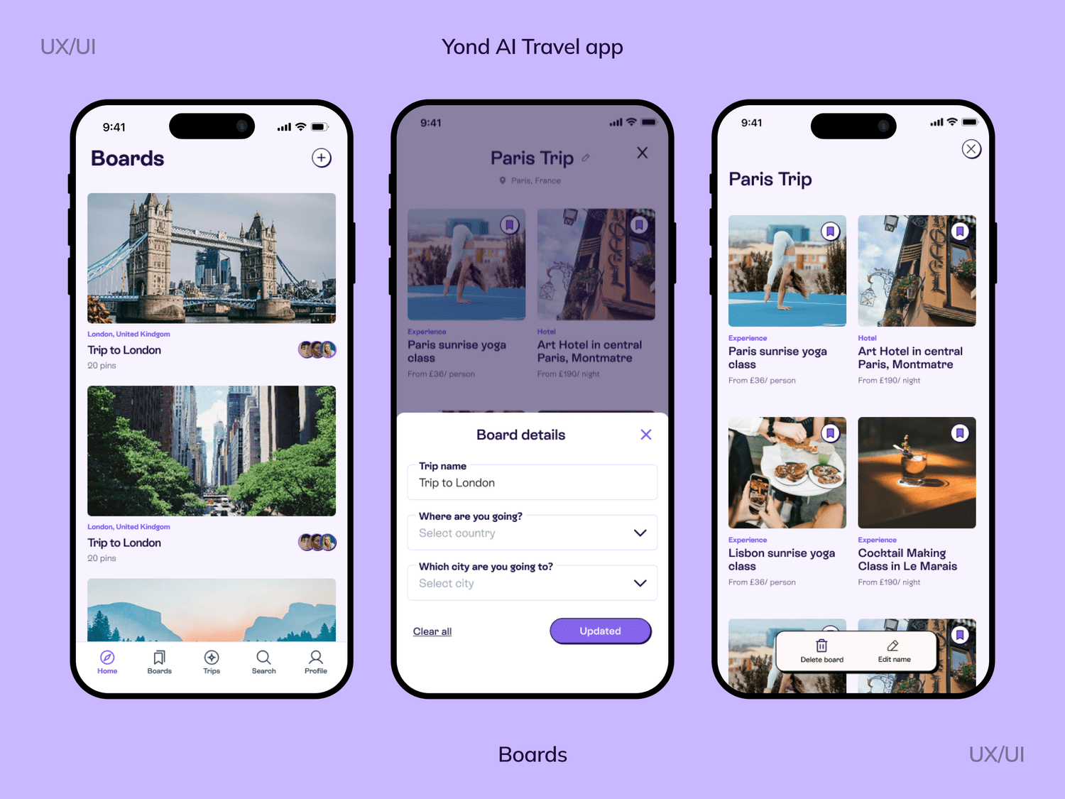
I collaborated closely with the dev team to test and refine key flows. Users can set up themed boards where they pin inspiration. From a board, users can trigger the AI trip planner. The flow guides them through preferences and then generates a full trip package: flights, hotels, activities. I added micro-interactions and improved discoverability of the “Pin” action. After testing with early users, we realised they wanted control but also guidance.
Experimentation & testing
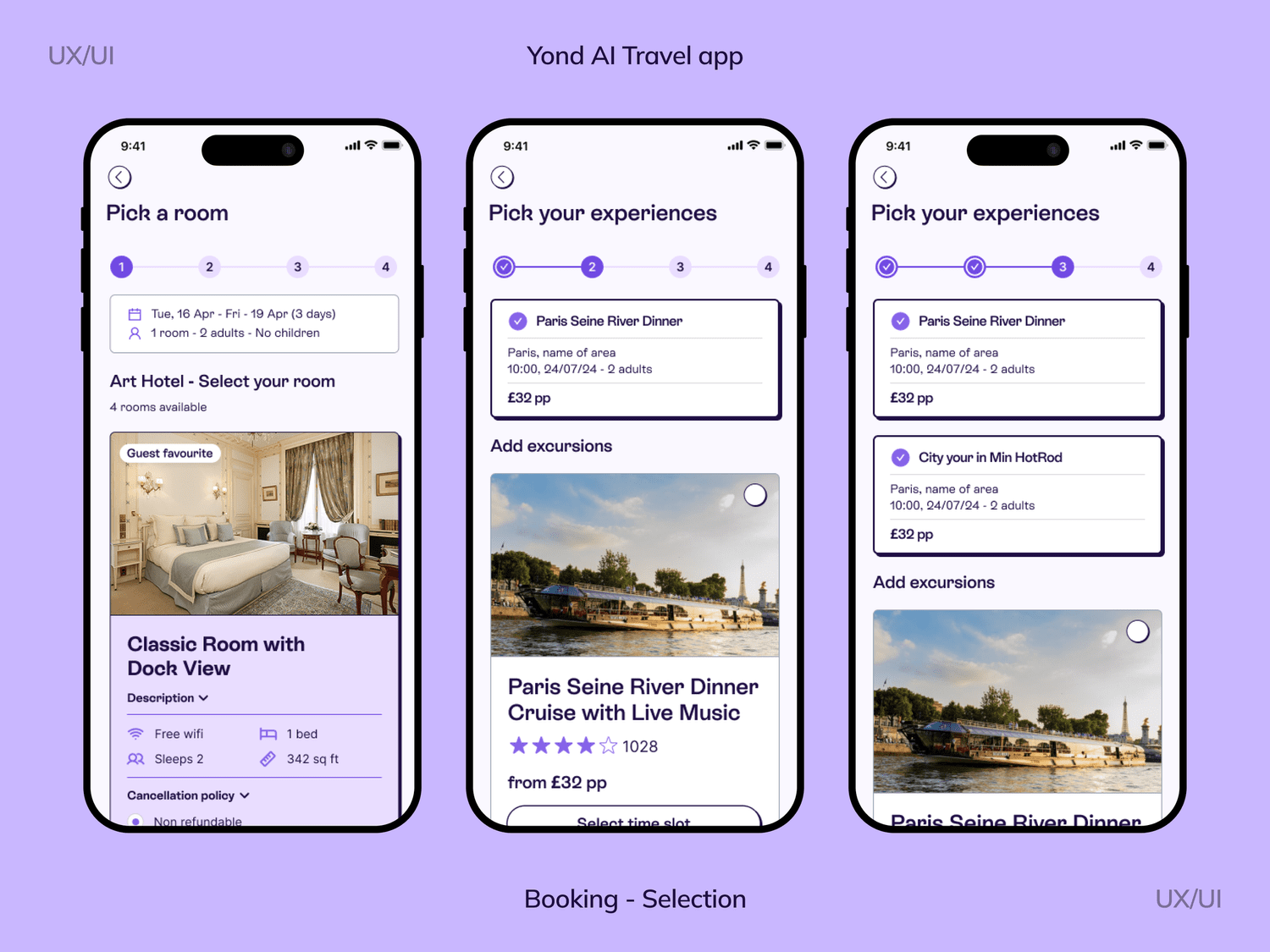
We iterated quickly, using lo-fi prototypes for early feedback, then moving to high-fidelity designs once the flow was validated. Ran usability tests with target users. Gathered feedback on how intuitive the journey felt. Adjusted flows to reduce friction points.
Building the design system
One of my biggest contributions was creating a scalable design system. Defined typography, color palette, and spacing system. Built reusable UI components: cards, buttons, modals, navigation, and pin interactions. Documented design patterns to keep consistency across the app. Worked closely with developers to ensure the system was easy to implement.
Results & impact
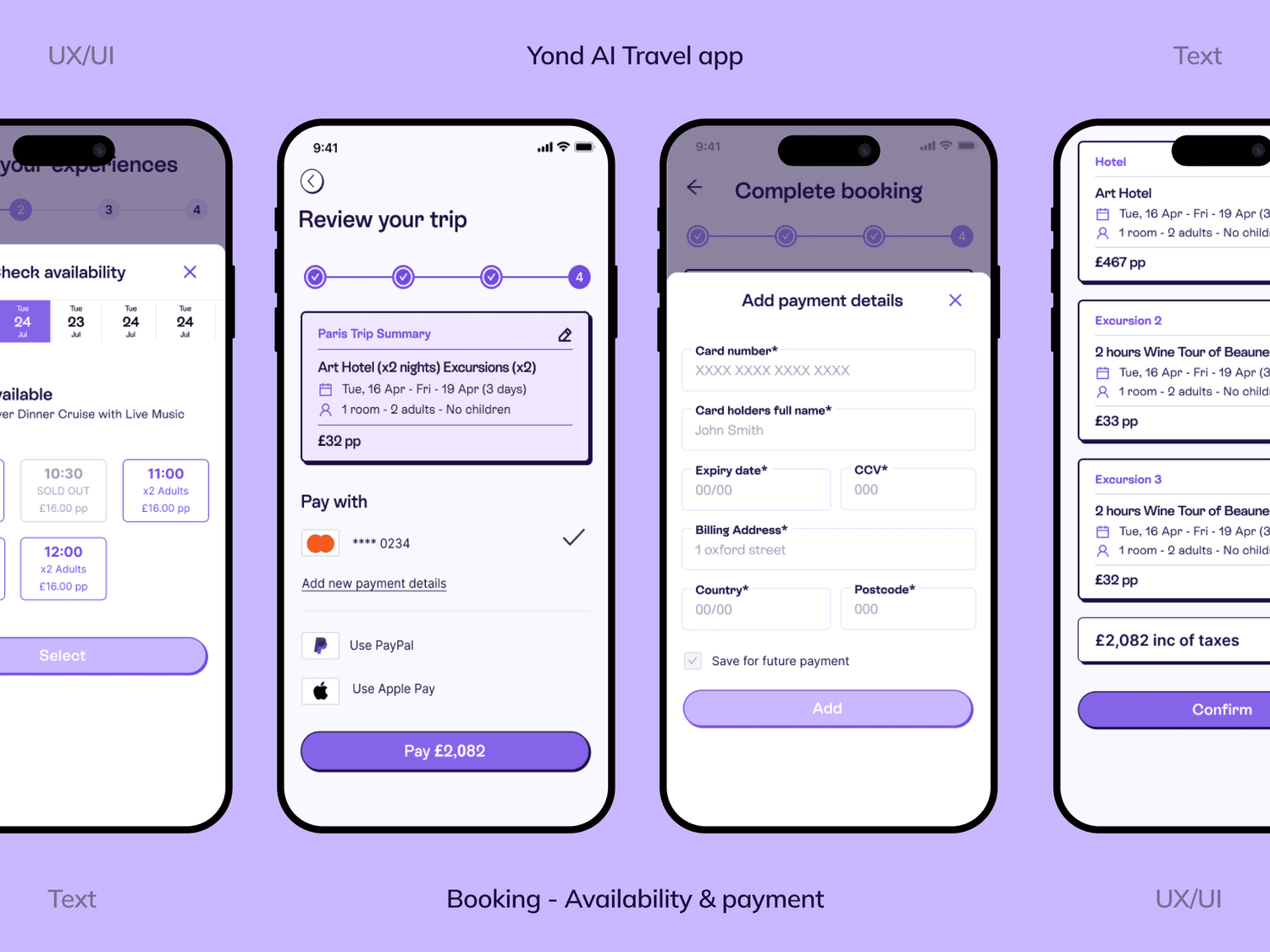
Clarity in the user journey: From browsing inspiration to booking a trip, the flow is now seamless. Stronger product identity: The app now looks and feels consistent across touchpoints. Faster iterations: Thanks to the design system, devs could build faster, and new ideas could be tested quickly. Positive feedback from early testers: Users highlighted how easy it was to go from “dreaming” about a trip to actually planning one.